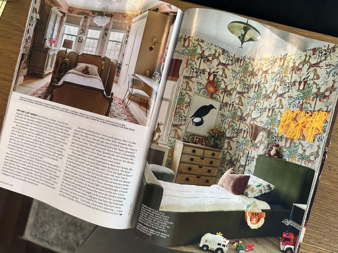
In a reaction against minimalism, the “maximalism” trend is a contrast to the white and light colored elements, minimal and small fixture lighting, and minimum objects and furniture designs trending this past decade. Simply, it’s a design that praises “more is more” with an aesthetic of excess from bold patterns and colors while mixing styles. It’s a hodgepodge look that’s intentional. It is more of everything: lots of color, lots of patterns, lots of layers, more is more. It includes design elements such as a mirage of furniture in different patterns, overstated chandeliers, and layered colors and textiles. It’s a daring aesthetic that requires practice in its eclectic design—you need to consider what you’re putting together and why, with pieces that speak to each other but also knowing when to stop. The maximalism design traces back to Versailles and ancient Chinese interiors where layering and detailed rooms were very vibrant. The spaces have a lot happening but everything feels cohesive. Last month I discussed the return of 70’s décor and guess what, surprise—that decade embraced maximalism too.
PHOTO: This month the Architectural Digest features a number of homeowners with maximalism decor including the cover story, Nate Berkus and Jeremiah Brent’s kids’ rooms, pictured below.
