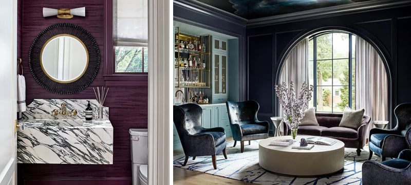
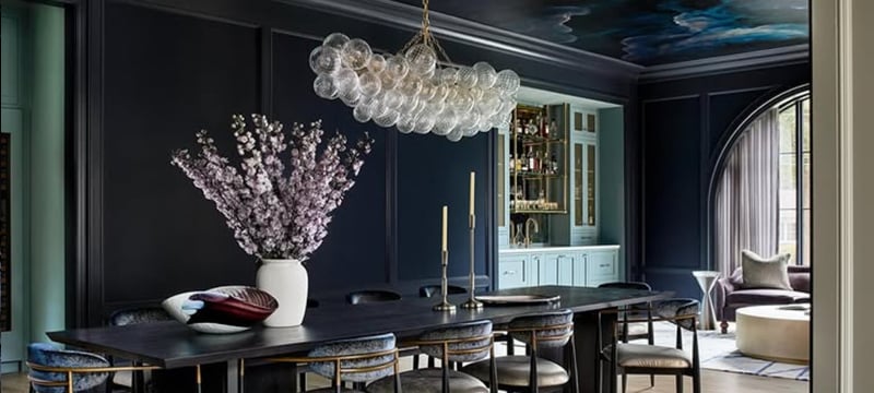
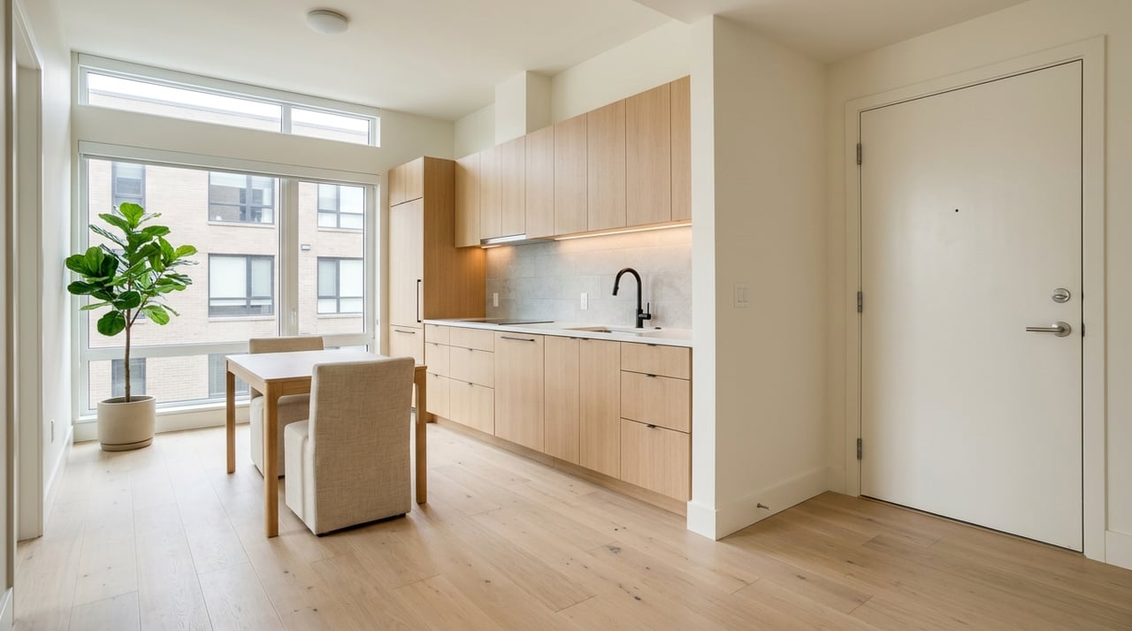
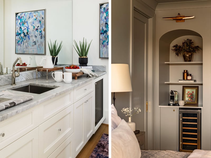
If you haven't noticed, purple is having a moment. Once reserved for royalty and eccentric art teachers (looking at you Miss Libby), it’s quietly sneaking into America’s design palettes as a sophisticated but playful accent.
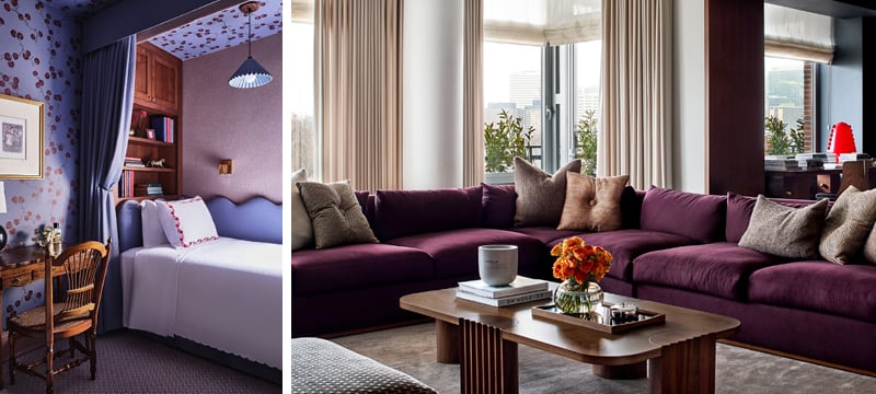
Think aubergine kitchen cabinets, lavender-hued tile in a powder bath, or a lilac velvet sofa anchoring a neutral living room. It’s not the head-to-toe “color-drenching” we’ve seen in maximalist interiors—it’s strategic pops that add depth and personality.
Why now?
- Color fatigue: after years of black-and-white minimalism, homeowners are hungry for richer palettes. Purple strikes the balance between bold and approachable.
- Psychology: purple evokes creativity, calm, and a touch of luxury—exactly the energy people want in homes post-pandemic.
- Trend cycle: jewel tones are returning, and purple is the fresh twist in the lineup.
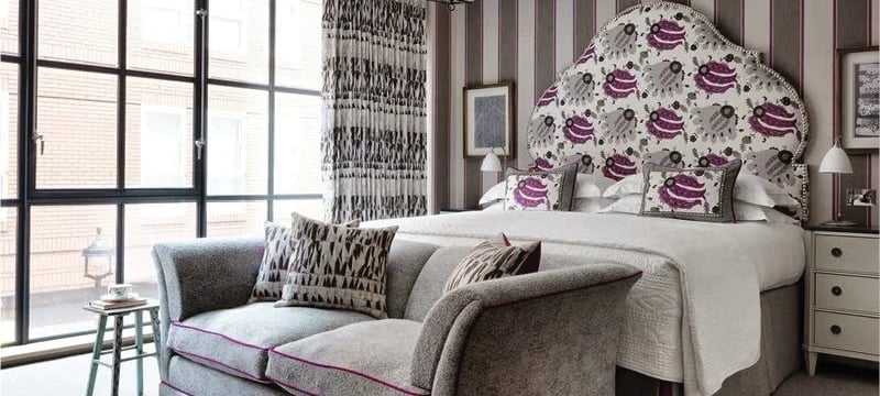
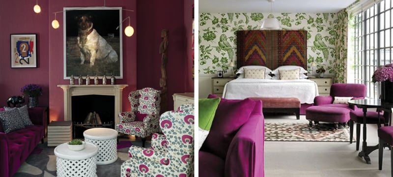
Designers are echoing this shift. Zoë Feldman calls purple a way to “bring richness and drama to a space that needs depth,” while Kit Kemp warns it can be overpowering if not balanced with neutrals. Dana Schwartz recommends accents—pillows, artwork, lighting — as the entry point.
The paint world is leaning in too: Glidden’s 2025 Color of the Year is “Purple Basil,” a bold, jewel-toned shade that signals how far interiors have moved beyond safe neutrals. And it’s not just on swatches: Livingetc, Martha Stewart, and Homes & Gardens are all spotlighting purple as a headline color trend for fall.
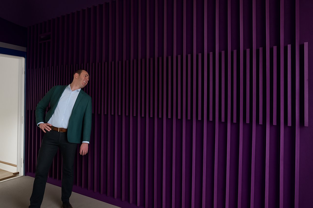
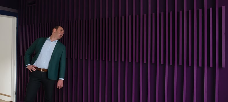
Even showrooms and model homes are picking it up—from lilac cabinetry vignettes in luxury kitchen studios to plum-hued upholstery in new build staging. What once felt risky is now a design flex: purple as the statement that says, “yes, this home has personality.”
Purple is no longer a niche move—it’s a conversation starter.
-----
How to Use Purple (tips with no need to fear the purple):
1. Go Bold in Small Spaces
Powder rooms, entryways, or a single wall in a home office (or that random Zoom backdrop). Perfect for saturated purples (aubergine, plum, eggplant). It makes a statement without overwhelming.
2. Layer with Neutrals
Lilac upholstery with warm woods or lavender textiles against creamy whites. Think of purples as the witty dinner guest—charming in doses, but best seated next to calm company. The contrast keeps purple looking sophisticated rather than eccentric.
3. Try Textiles & Accents First
Not ready to commit? No problem. Throw pillows, artwork, rugs, or a velvet accent chair let you "date" purple before marrying it. Low risk, high impact.
4. Mix with Metals
Purple loves shiny friends. Purple + brass = glam. Purple + matte black = moody chic. Purple + polished nickel = timeless. Metallics help anchor the color.
5. Watch the Light
Purples shift dramatically with lighting—soft lilac can look gray in low light, while aubergine glows under warm bulbs. Always test swatches in the room before committing.
📸 Courtesy of Zoe Feldman Design, follow her @zoefeldmandesign
📸 Courtesy of Kit Kemp Design Thread, follow her @kitkempdesignthread
📸 Courtesy of Dana Schwartz Design, follow her @danaschwartzdesign
📸 A new build by Elevation Homebuilders installed a wood paneled accent wall painted in plum
_____________________________________
Adam Pretorius is a top-producing luxury real estate agent in Iowa City. Follow for more real estate news and design trends.
