Every year, design trends show up. Some have confidence but they just haven't earned it. Here's a list of ones that were supposed to make life better, not harder, louder, or more annoying.
- Raised Bars
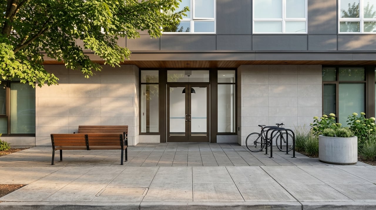
Why are we still pretending we need stadium seating? Lower the bar. Literally. This was horribly overdone in the early millennium but bar-height is the ankle-breaker of kitchen design. They block sightlines, break up kitchens, and create awkward height transitions that can't even fit dishware. And for some reason they're still being used! We just need to eliminate bar height permanently! A single-level island is cleaner, more inclusive, and infinitely more timeless. Worried about your dirty dishes being seen from the living room? Just put them away. Easy, solved. - Open Shelving
Yes, it photographs beautifully. No, that does not mean it works. Open shelving collects dust, grease, and visual clutter. Doors exist for a reason. Function still matters. - All-White Everything
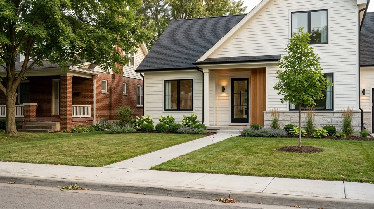
Kitchens, baths, exteriors--congrats, you built a luxury hospital. White isn't timeless when it's overused; it's sterile. Depth, contrast, and warmth are what make spaces feel lived-in and intentional. A little white goes a long way. Oh, and exteriors--we don't need every neighborhood looking like a farmhouse. - Batman-Black Accents & Over-Dramatic Decor
Moody design is great. Over-the-top drama is not. If your house feels like it's brooding, plotting, or preparing for a true-crime reenactment, something has gone wrong. Black should anchor a space, not interrogate it. The Batman black accents and over "dramatic" decor is over. Sorry flippers of the past five years. - Over-Textured Everything
I like maximalism. I really do. But maximalism still needs editing. When every surface is fluted, reeded, ribbed, boucle-covered, grass-clothed, brick-exposed, and terrazzo-ed, your eye doesn't know where to land--and eventually gives up!! Texture should guide the eye, not exhaust it. One hero texture per space is bold. Seven is visual burnout. Your eyes are tired, let them rest. - Curvy Furniture
It had it's time, time to return to the box. It's like a square wheel--not the right shape for its use. Curves have their place--galleries, hotels, institutional spaces meant to be walked around. In homes? These sofas look like sea slugs or some type of insects. They eat square footage, limit layout options, and rarely age well. Comfort and efficiency still mater. Organic shapes are lovely. Insects-as-furniture is where we crossed the line. - Bedrooms with No Nightstands
I don't know why these even had appeal. Minimalism should simplify life, not remove all surfaces. Phones, water, books, glasses, alarm clocks--where are these supposed to go? Floating everything into oblivion isn't design-forward; it's impractical. A bedroom without nightstands isn't serene--it's mildly hostile. Looking like a college dorm is not okay. Minimalism is great, dysfunction is not a design style. - Too Many Pocket Doors
Yes, pocket doors are better than barn doors. Still annoying--also yes. They're often poorly insulated, terrible for sound control, and somehow always manage to slam like they're angry at you. Used selectively, they're fine. Used everywhere, they become a daily reminder that trends sometimes ignore physics. - Overdone Color Drenching
Color drenching can be stunning--when done intentionally and sparingly. One room wrapped in color? Gorgeous. An entire house? You now live inside a highlighter. Contrast gives color its power. Without relief, saturation becomes oppressive. Moderation is still sexy in 2025. - Burnt Orange 70s Revival
We did this. We loved it. We overdid it. We moved on. The design world has already advanced into its 80s era, and burnt orange is officially giving "time capsule." And yes--I say this as someone who owns orange chairs. Trends move fast. Forgiveness is part of the process.
If your house includes some of these elements, that doesn't make it bad. But trends are tools, not personalities. The best homes aren't chasing what's loud--they're building what lasts. Good design ages gracefully. Bad design just ages...loudly.
And if this lists stung a little (--and yes, I too have some improvements to do myself)? Good. That means you care.
📸 Some updating is overdue. My burnt orange leather furniture—once on trend—has officially aged out as the design world marches boldly into the 80s (it happens). The bigger lesson, though, lives in the bedroom. While they’re all due for updates, the real issue is one my wife and I have learned to tolerate: pocket doors. They sounded like smart space-savers at the time. In reality, they fail at light, sound, and privacy. When we finally remodel, the pocket doors go—and real doors come back. Some ideas look good on paper. Perhaps others need to stay there.