Every year, paint companies release their “Color of the Year.” Most people treat them like trends. I treat them like "signals"--take note, but not gospel.
But here's what we can see in this year's color trends. When you step back and look at this year’s selections together, a clear message emerges: we’re done with cold, sterile spaces. This year’s colors are warmer, calmer, and far more intentional.
Here’s what the major paint brands are telling us—and how it actually translates into real homes.
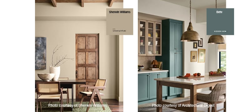
Warm Neutrals Are Officially Back in Charge
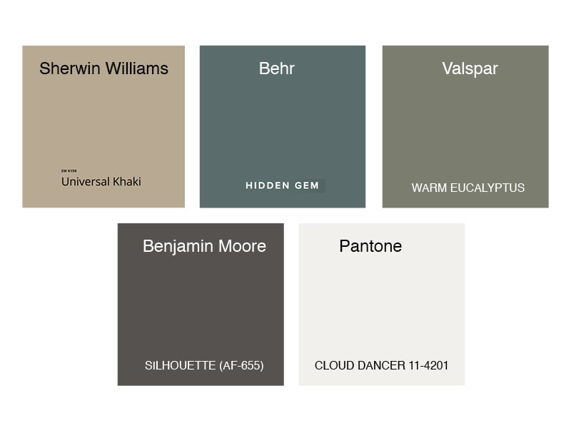
Sherwin Williams chose Universal Khaki.
This isn’t a beige (or a comeback). Warm khakis, soft taupes, and mushroom tones replace cool grays that once dominated everything from flips to luxury builds. They feel decorative, adapt better in changing daylight, and photograph warmer. This is the new safe choice—and it’s far better than gray ever was.
Green Has Become the Most Trusted “Bold” Color
Both Behr and Valspar leaned into green—with Hidden Gem and Warm Eucalyptus.
Green works because it behaves like a neutral while still delivering depth. Soft olives, eucalyptus tones, and muted jade colors ground a space without overwhelming it. They pair well with wood, stone, brass and black metals. Nervous about commitment? Green is the smartest answer this year.
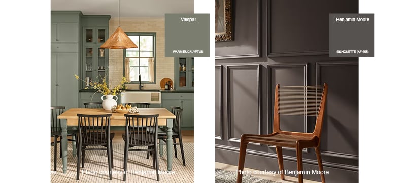
Dark Neutrals Are Replacing “Moody Black”
Benjamin Moore's pick, Silhouette, is a deep, espresso-leaning neutral—not a black, not a gray.
This reflects a bigger shift: darkness is moving away from harsh contrast and toward warm depth. I'd use this more sparingly in rooms like offices, libraries, bedrooms, or on built-ins and cabinetry.
White Isn’t Dead—It Just Grew Up
Pantone surprised many by selecting Cloud Dancer, a soft, airy white. Yes, W-H-I-T-E!! Bright, cold whites are fading. Warm whites—creamier, softer, and more forgiving—are taking their place. White now works best as a supporting actor, particularly when you need a backdrop for layered materials.
What These Colors Have in Common
Here's some good news from the past few years, despite coming from different brands, these selections share one thing: restraint. They’re not trying to impress you in a showroom. They’re trying to last ten years in a real home. Instead of chasing attention, these colors hold it.